A weekend of Art and Design in Melbourne

It's always nice to escape to Melbourne for a cheeky long weekend to catch up on the food, design, architecture and art happenings.
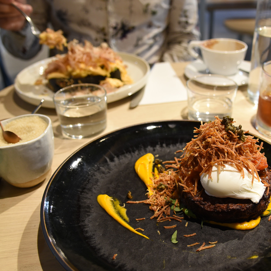
Our favourite foodie discovery for the trip has to be The Crux and Co in South Melbourne - with an all day breakfast and lunch menu, eclairs, cakes and some rather sexy interior design we ended up making two visits during our short stay!
For breakfast I delved into zucchini and sweet potato fritters with carrot purée and much as I did love it, Geoff's choice of smoked salmon scrambled eggs with bonito, tobaki and edamame beans on charcoal toast was mindblowingly good and even more delicious!
Our next visit was lunch and I chose the Poke bowl - sashimi tuna chunks, lots of veggies, lime mayo and rice with interesting bits in it (quinoa and sesame seeds) which is a good combo for me. It wasn't a surprise that Geoff chose the pulled pork burger with wedges.
The design is slick - I love the beautiful veneer tables with their inlay of brushed rose gold and the way the curves and corner edges reflect the design of their logo. The caramel and soft grey blue tones are lovely and calming as well and with the lush pops of plants above made this a nice place to hang out.
A yuzu chocolate brownie creation - yuzu is just one of the most refreshing flavours and gives an energetic lift to the chocolate base.
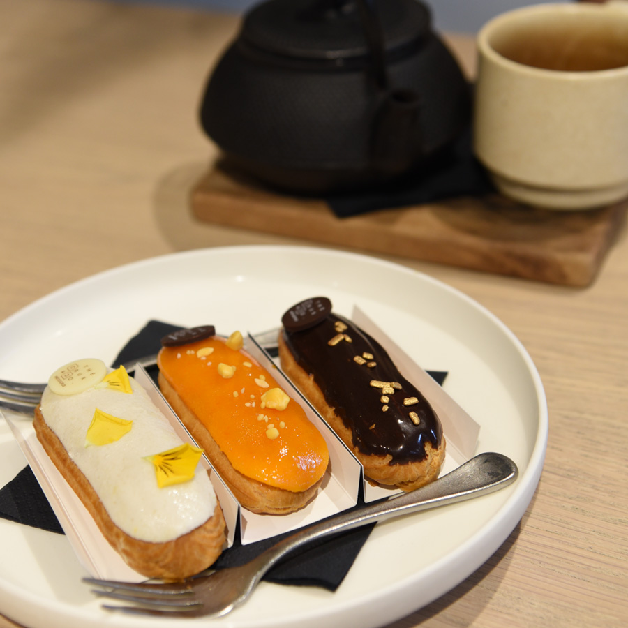
A trio of eclairs - this is one of the specialities of the house and from our observations they sell out quick so go early.
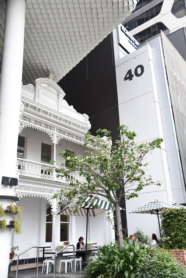
Whilst in the area check out The Kettle Black across the road if only just to marvel at the amazing juxtaposition of architecture - the old heritage terrace house nestled in amongst the folds of the contemporary building - the top finial just brushing within millimetres against the new building that has wrapped around it.
“Hokusai skilfully draws any shape;
drawing what you can see with your eyes
and what you feel in your heart”
Umezawa hamlet fields in Sagami Province from the Thirty-six Views of Mt Fuji series by Hokusai
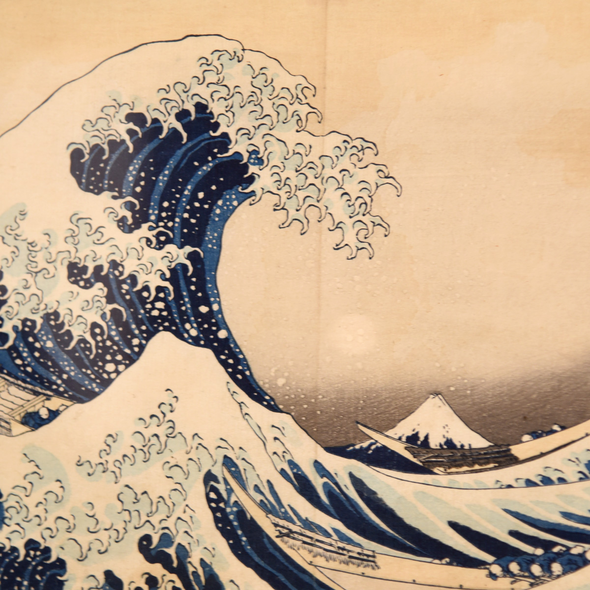
As a lover of Japanese culture and design the exhibition of Hokusai woodblock prints was a wonderful opportunity for me to delved deeper into my passion. I really enjoyed reading all the information about each piece and the slice of life it revealed. As a graphic designer it is also interesting and inspiring to see how he composes each design, using line and layout to dramatic effects. The limitations of the woodblock printing technique with it's restricted colour palettes is also fascinating - the original concept of Hokusai and the publisher for the Thirty-six Views of Mt Fuji series was to exclusively use Prussian Blue printed in different degrees of dilution, though this initial approach was altered to include other colours as their work progressed.
The joy of visiting an exhibition to see artworks in person is the ability to peer closely at the details, to see the gradual tones of colour, the tiny figures in corners or the way the artist has rendered the spray of the waterfall as it cascades down.
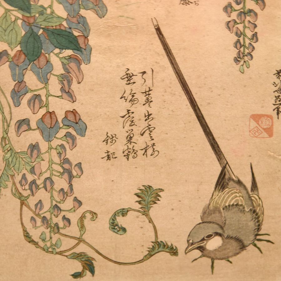
The series of flower and bird prints were particularly relevant to my recent fascination with these subject matters.
Two versions of the Great Wave were on display side by side, a wonderful opportunity to play spot the difference between impressions of the woodblock.
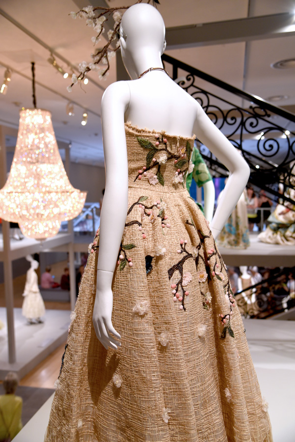
Stepping inside the House of Dior exhibition is just like stepping into the fashion house atelier.
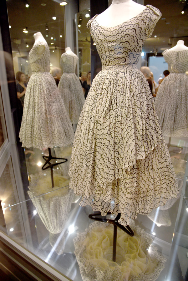
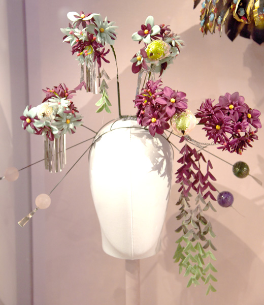
The other exhibition we saw at the NGV was the House of Dior celebrating the work of all the designers throughout the atelier's 70 year history. The exhibition design was fabulous - the rooms are all set up to reflect the style and atmosphere of stepping into a French fashion house and I enjoyed the way the exhibition unfolded through the history and ideas of Dior. Again I particularly appreciated being able to observe the finer details and intricate textures of the dresses.
Across the road we checked out the M Pavilion. A temporary structure designed by Rem Koolhaus and David Gianotten from OMA for the Melbourne Festival as a meeting place and forum for events and ideas to be shared. The pavilion is almost not a building - appearing more like a floating roof hovering over the hill beneath which people gather still completely connected to the gardens surrounding the space. It is rather playful, typical Koolhaus style.
I love the glimpse of the Melbourne Tram sliding past the pond at the Botanical Gardens. This shady corner was a lovely respite on a hot Melbourne day.
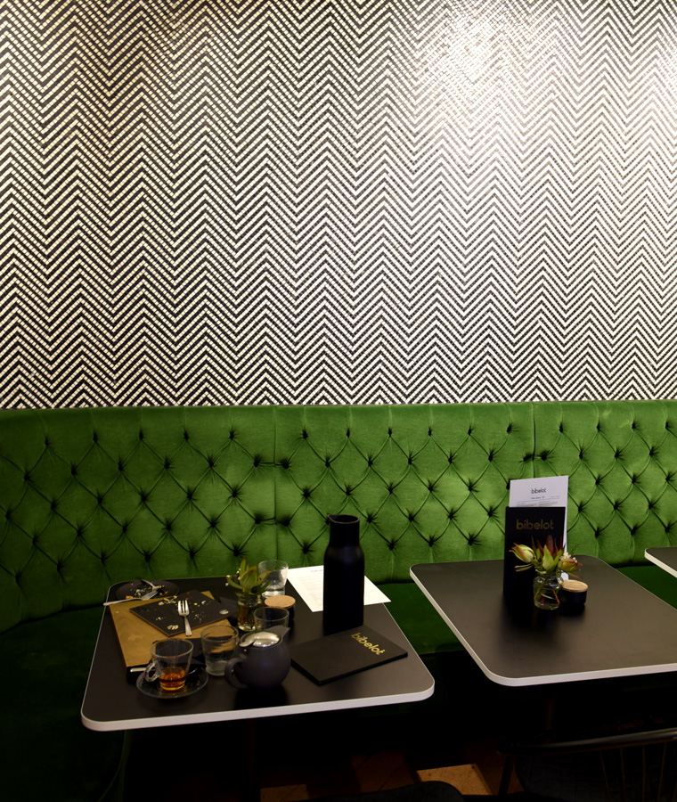
After our dose of art we headed over to Bibelot in South Melbourne for an injection of afternoon sugar rush. We couldn't decide which cakes to go for so we settled on the gourmande selection and a caramel apple number. We're slowly working our way through a stash of other chocolate goodies we took back with use to Sydney - make sure you grab a packet of the caramelised puffed corn, milk chocolate and pink salt chocolates, they were amazing and we demolished it in one sitting!
This is another place where the interior and graphic design choices are also inspired and luxurious to enjoy.
The array of sweet treats at Bibelot, South Melbourne.
Italian style dinner at Gilson's by the Botanic Gardens.
Dinner was at Gilson's on Domain Road across from the Botanic Gardens. The dishes are hearty and generous so be warned - don't order to much unless you are famished! Our favourite was the roast chicken with lemons, zucchini, broccoli and hazelnuts - a great combination that we both relished.
The elm trees of Melbourne were particularly prominent during our visit as the translucent seed pods drifted through the winds and over the pavements all around us.
I always enjoy an opportunity to stroll amidst nature so we took advantage of our stay close to the Melbourne Botanical Gardens to admire the different specimens. Melbourne has a strong display of classical European trees and I do rather love these traditional beauties - the oak, the elm, the birch.
We stayed at the Blackman for our sojourn and had the opportunity to zip around town in one of their smart cars - though 'zip' might be an over-statement as the smart car was rather sluggish on the handling and not quite as manoeuvrable as one would hope from such a small car.
The streetscapes of Melbourne are continuing to develop their unique geometric quality of contemporary crisp zig-zagging lines - the architectural decisions somehow reflecting the network of tram lines that traverse the city.
Whilst we spent most of the time in the South of Melbourne I did duck up briefly to enjoy a lunch at Code Black in Brunswick and pick up some goodies at Love Hate and Tree Top Toy Shop.
I tucked into a chicken cotoletta with lots of kale and an apple slaw. A really good fudgy liquorice scented brookie and a cup of cold brew coffee hit the spot perfectly.
With such a short visit it was good to explore some different areas - though it is hard to believe that for once I went to Melbourne and didn't visit either the Block Arcade, Little Collins street or Fitzroy!
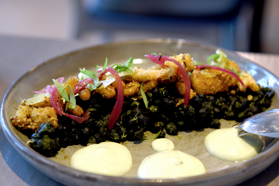
Spiced calamari and squid ink pearls
For this trip the only visit to the city we made was to quickly duck into the corner to check out Tonka for dinner to enjoy a splash of contemporary Indian cuisine. You enter through one of Melbourne's classic dark alleyways layered in years of tags and art clustered on top of each other, you step into a classic dark contemporary bar and then comes the big reveal as you move to the back of the restaurant and the space fills with light and the view across the Yarra with big mesh clouds floating above you.
Melbourne certainly does know how to nail good interior design!
Coconut spiced spanner crab on betel leaf


